Thanks to artist Rick Nease, our book covers keep ‘Shining Brightly’
What’s the goal of a great book cover?
Our covers leap into your mind’s eye.
“I love that cover!”
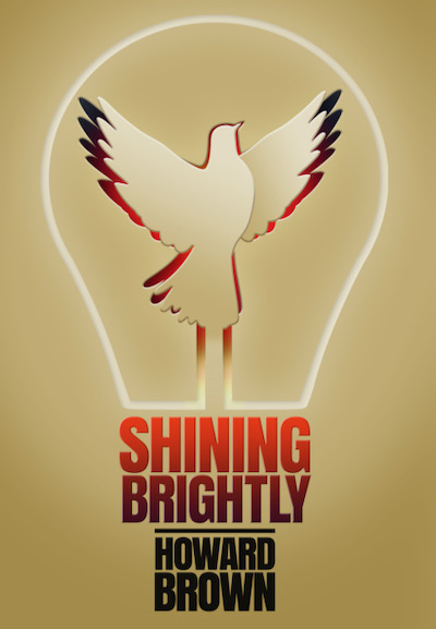
Those four words make author Howard Brown smile everyday, since he’s been carrying a copy of his new book with him wherever he travels nationwide. Those words often are sparked as someone takes a good long look at the cover of his memoir, Shining Brightly.
Those long glances usually are followed by a smile and a thoughtful: “Hmmmm.”
“What do you see?” Howard asks.
He knows the answers will vary widely:
It might be just one word: “Hope.”
Or an emotional response: “It makes me happy.”
Often, the viewers want to be sure they’re seeing what Howard intended. They might say something to him like: “I see—resiliency. Whatever knocks you down, Howard, you just keep rising again—right? You’re a survivor. That’s what it means.”
Or: “It shows the birth of an idea, an innovation, an invention—you know, a light bulb and then a fresh idea flying up with the light, right? It’s a symbol of you as an entrepreneur. It shows how your best ideas are born.”
Or: “Well, it’s a dove—so, it’s a symbol of peacemaking, right? You’re a peacemaker.”
In fact, all of those answers are correct as the true stories in this memoir unfold across 18 chapters in which Howard becomes an early Silicon Valley entrepreneur, survives deadly cancer twice and becomes an internationally accomplished “whisperer,” a mentor, counselor, caregiver and peacemaker.
The cover was designed by Front Edge Publishing’s longtime art director Rick Nease, who has created one memorable cover after another over the past 15 years.
All it takes is a glimpse—
Rick Nease’s covers will leap into your mind’s eye
Rick began working with us after a long and distinguished career in media. Just take a look at his website to get a sense of his visual genius.
Here are just a few of his memorable book covers. Click on the links to jump to the Amazon pages and see those covers displayed.
Here’s the first example: Ken Wilson’s ground-breaking best-seller, A Letter to My Congregation, tells the true story of how, as a pastor, Ken invited members of his congregation to welcome LGBTQ Christians as full members. After reading the book, Rick envisioned the central Christian image of a cross—but a cross that has been painstakingly stitched together with many threads, including a handful in rainbow hues.
When we launched our popular series 30 Days With …, Rick picked up on our idea that these books would be read over 30 days by readers, who we expected then would want to save them for future re-reading over the years—or perhaps would share them with friends to read them for another 30 days. “We expect these books to be read and re-read over the years,” we said to Rick. And his visual genius was to make that point by pre-stressing the cover. That’s how we wound up with the distinctive worn-and-frayed imagery along the bottom edge of covers in this series. As a publishing house, we know you’re going to love these books so much that you will read them until they begin to fray.
When we were working on Friendship & Faith with the WISDOM women’s interfaith organization, we wanted to show that the book truly represented a diverse community of stories. In those pages, dozens of women share their own inspiring stories of finding friends across cultural, racial, ethnic and religious boundaries. Rick’s visual solution was a mosaic of the women’s faces.
Then, one last example: Anyone who sees Rick’s distinctive heart-cradled-in-hands circle on the front cover of A Guide for Caregivers can never forget that image.
What makes a great book cover?
WIRED magazine once put it simply in an overview of design principles in publishing: The best book covers “have something weird going on.” Our eyes are snagged by the central image and simply have to look. That’s true of Rick’s best covers. There’s a central image that’s out of the ordinary.
Over the past decade with the rise of digital media, quite a few publishing-research studies have examined the impact of book covers on the purchasing choices of customers. In particular, as cover images have shrunk into the thumbnail images we see online, perhaps as tiny rectangles on our smartphone views of Amazon, researchers wanted to know if it even made sense to design covers with central imagery. Perhaps simply type alone would suffice, since these thumbnails were becoming so small. Maybe just the title and author’s name was enough? However, time and time again, researchers found that shoppers preferred books with vivid cover imagery.
In writing this column, I asked Rick how his mind worked as this image sprang to life.
First, he said, there’s no question: “This needed to be graphic-driven, incorporating the title and the author.”
Well, that’s exactly what the research shows works best when selling books. So, check that box.
Plus, Rick said, “I wanted this to look as hopeful and optimistic as the book.”
Check. And, check.
Then, the unique idea came to him—what WIRED calls the weirdness of a great cover. Rick explained it this way: “After looking at my sketches, I really liked using a lightbulb with a dove rising out of it. And—I wanted this to look like it was cut out of paper.”
Bingo! That image definitely has lodged in the minds of everyone across our publishing community who has seen this cover.
We’ve all experienced the power of Rick’s unusual, almost tactile, cut-paper concept first hand.
Howard said, “Yeah, I’ve had it happen to me a number of times. People will reach out very carefully to touch the cover as if the edges of the wings are 3D pieces of paper that pop up out of the cover. They’re often surprised when they discover it’s a flat image.”
Howard concluded, “I’m just thrilled with this—I mean, I even had cookies made with the cover! Now, I hope you’ll write a story about the importance of a brilliant cover like this. And I hope you’ll thank Rick for his amazing work.”
And so, we have.